
Back in April 2016 I wrote an entry on the benefits of printing vis a vis a means of archiving photos. In this post I’m revisiting the subject of photographic prints.
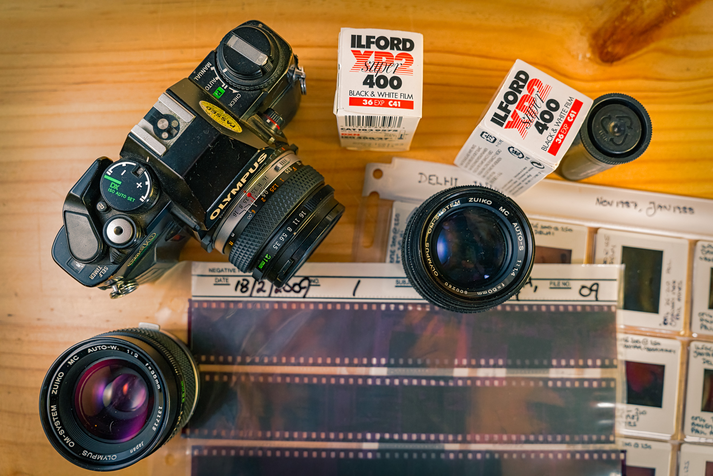
As I said before photographically I grew up in the golden age of film photography. High quality colour prints were cheap and easy to get with the proliferation of 1 hour photo labs. When it came to black and white photography I learned to develop and print in a friends bathroom and the exhilaration of watching that first print appear is still with me after nearly 40 years. Prints were what photography was about. The advent of digital photography, the internet and social media changed that and now a great many people don’t have their photos printed but prefer to view them and share them via screens.
In 2022 why should we bother with the outdated medium of photo prints? Well firstly I think making prints is a great way to improve your photography. Secondly I think that it is nice to have a tangible result from your photographic labours. Lastly I think it is an enjoyable experience – taking the photo and then working through the process to making a good print.
How does making a print improve your photography? Well it would seem that if you want to take good photos you need a 24x36mm sensor (so called full frame) with huge dynamic range, low noise, and super corrected lenses to give you bags of micro contrast. But, the reality is that any digital camera with a four thirds sensor or larger from the last 15 years is capable of producing beautiful prints the equal of any of Sony’s, Canon’s or Nikon’s latest super camera.

You can’t make a silk purse out of a sow’s ear the old saying goes. At the picture taking stage you’ll need to ensure you are getting the best out of camera with technique. Learn the sweet spot of your lenses sharpness. Understand Depth of Field. Know when to take over from autofocus and do it manually. Good handholding technique or use of a tripod to get the most resolution. Good exposure. Learn the difference between subject brightness range and dynamic range. Here in Australia a scene’s brightness often exceeds what a camera can render meaning you loose information in the shadows and highlights. So a good exposure is one where you decide what is the most important part of your prospective image and then decide what you want as detail in the shadows and highlights. Use your histogram to help you. When I was teaching photography at art school the most often heard comment from students was “I’ll fix it in Photoshop”. As you boost the exposure or lift the shadows in your editing software you introduce noise and colour casts. Crap in equals crap out! Get it right in camera and you’ll have an easier time.
Now we’ve got the image onto the computer. Edit to taste but be aware that we don’t want to loose any information by blocking up the shadows or blowing out the highlights. This should be relatively straightforward as we got a good exposure. So how do we prepare a picture for printing. Well just as your camera has its dynamic range so does your computer screen and your printing paper. So you’ve taken a photo of a scene where you have reduced the subject brightness range to fit in with your cameras dynamic range. Opening it up on your computer the screen has a greater range because it is backlit. So you can see loads of information in the shadows and the highlights look very bright and detailed. Most people prefer this – lots of contrast and bright colours. One of the reasons why they don’t print is that their photos don’t look like this when printed. So to get the image so it looks right in the print we have to match it to the dynamic range of the printer and paper. This where colour calibration comes into play. We need to have the image on the screen at a known value. When I take an image I shoot in RAW as a means of preserving all the possible information. I calibrate my screen monthly with an x-rite colormunki and have it set to automatically react to changes in the ambient lighting. When I convert the RAW file it is to an uncompressed 16 bit TIFF in ProPhoto RGB this ensures that there is as much colour information as possible. So now the image I got right in my camera is now right on my computer screen.
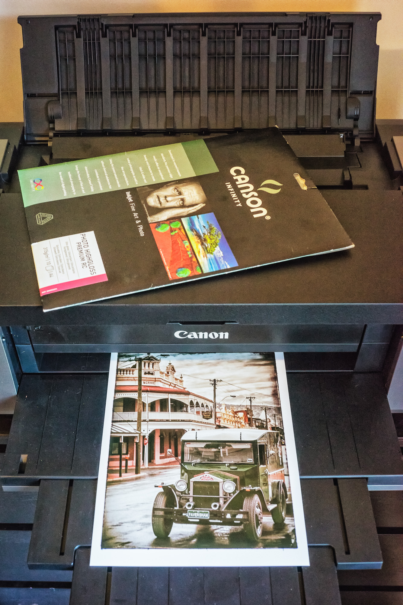
It’s now time to think about printing. Now you can choose to do this yourself on a home printer or you can send it out to a lab. There are pros and cons to each. With a lab somebody else manages the printer and you just pay for the print, but the whole process from editing to test print to final print is slower. Owning your own printer means you have to outlay money upfront for the printer, ink, and paper and then manage all the colour profiling yourself, but the whole process is quicker and the feedback immediate. I have a printer as I like the whole process from beginning to end. But either way there is something you need and that is the ICC profile of the printer and paper you are going to use. If you use a good lab they should be able to supply the profile for you. If are going the DIY route then go to the website of the paper manufacturer and download the the profile of the paper and printer you are using. The ultra keen can do their own test strips and profile their own printer. I choose to use the canned profiles from the makers as I don’t want the faff of creating a new profile every time I open a new box of paper or change an ink cartridge. Once you’ve got the profile follow the makers installation instructions.
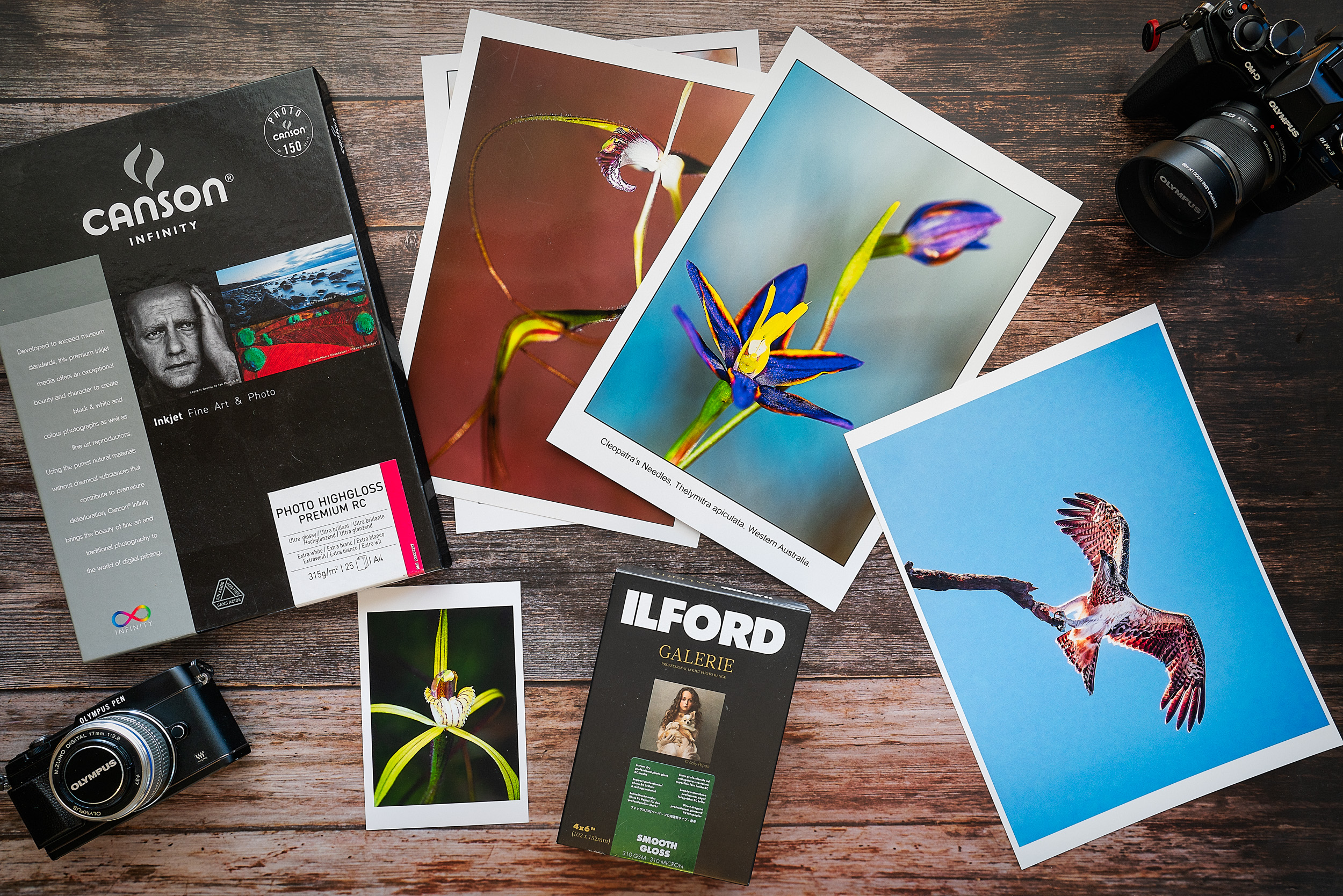
Your printer and paper have a dynamic range that is much smaller than that of your camera and computer screen. So the trick is to literally squash all that image information so that it fits within the range of the printer and paper. One of the key tools to this is using the soft proofing feature of Photoshop or Lightroom. To use the soft proofing feature make sure that the profile you’ve just downloaded is selected and then activate it. Immediately you’ll see your beautiful image looks muddy and lacks contrast – in fact it looks horrid! Relax it only looks horrid because that is how your screen is interpreting it. Now’s the time for a test print. I make 6×4 (10x15cm) test prints ‘cause it’s cheaper. If you’re going the photo lab route things get a little protracted as you send out the image file in the format they prefer and then wait for the lab to send the print back. Home printers can feel smug at this stage as you wait for the printer to finish in a matter of seconds. Look at the print under daylight or an artificial light source balanced for daylight (5600K). Is it too dark, too light? Too much contrast, too little? Are the colours how you saw them? Make the necessary changes and test print again. Some advocate taking a break of a couple of days before making the final print while having the test print pinned up somewhere you can keep looking at it. I don’t do that – I’m too impatient I suppose. When you’ve got the final print leave it somewhere clean and flat and let it just dry out thoroughly before you frame it or put in an album.

This is a learning process. Some photos are harder to work on than others for example pictures of bluebells are notoriously hard to print so that you get a blue flower rather than a violet one. This is because your camera does not see them as you do. But as you go on you learn more and more and this becomes incorporated at the taking stage so your photographs begin to improve.
A surprising thing I’ve found is that when you start looking a prints up to 29x42cm (A3) is that it is very hard to see differences between images from 12Mp full frame, 16Mp m4/3 image, 18Mp APSC or a 42Mp full frame. Printing larger starts to show the deficits both in terms of equipment and technique, but it is possible to take an image from my old Canon EOS5d, which had 12 Mp, and print it at a size of 100x150cm and get a very satisfactory result.
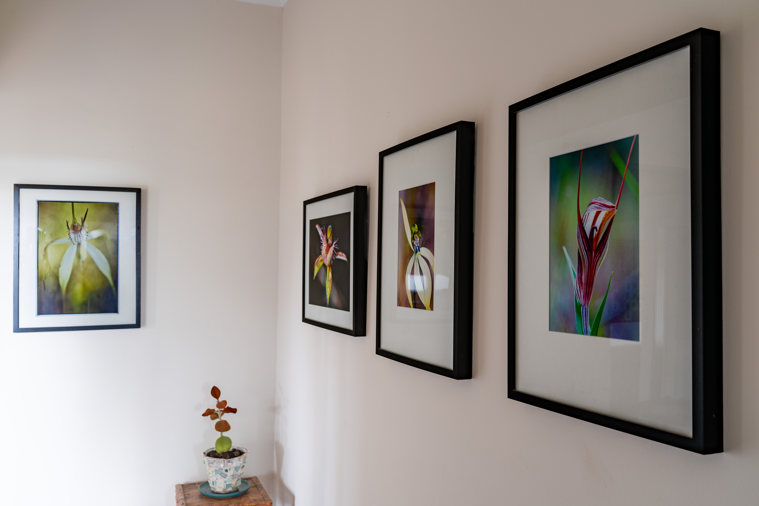
I’m a great advocate of putting prints up on the wall and living with. First because of their artistic or aesthetic value. Second because there is nothing like looking at a print day in day out to make you think how the photo works. Is the composition good, is the sharpness good etc etc. This will spur you on as you advance along your photographic journey. Not all the photos you print and display need to be works of art. My partner and I were sitting around one evening talking about when she lived in Stoke Newington in north east London. Out came the shoe box of photos and it was great looking through them and talking about them. We both realised that we had a bit of a gap in our family photos. Nothing after the start of digital photography. So we’ve both committed to making prints of family, friends, trips and holidays with the aim of creating a photo wall.
The whole process is a lot more involved than I’ve written here. To get you going here are a couple of useful websites:
- Cambridge In Colour – this is a great site with lots of info and an active forum
- Image Science – this is the web site for a business here in Australia, but the educational side has tons of useful information.
Discover more from paulamyes
Subscribe to get the latest posts sent to your email.

One thought on “The Printed Image”
Comments are closed.